Is the website header an important part of optimizing for a better user experience and to help users navigate your site more easily?
It’s the HEADER part of your site that helps users navigate your site on each page.
Navigation is an essential part of every website, and it should be organized and easy for the user to understand.
When you enter a website to buy something, you always look to the search box so that you can search for your desired product.
Otherwise, if you need to know about your next online business project, you must check the website’s services or pricing pages.
These are common scenarios in our daily web browsing and navigation. But the question is, does header optimization really matter for a website?
Depending on the user demand, you can’t ignore the header portion of your site for user convenience.
Also, you should make it accessible to everyone who enters your site without prior knowledge about your site.
After reading this blog, you will be able to acquire knowledge of website header optimization and which aspects you should focus on for different devices.
In this blog, I’ll share how to optimize the header of a website for better user navigation.
Here are the six aspects that you should focus on completing to make it accessible for users.
Navigable Header Design and Appearance
Ensure that all menu and sub-menu items are navigable as fast as possible after loading the website.
If your header loads perfectly before loading the whole site and it is clickable, that is the perfect way to present it to the users.
Easy to navigate and access a header makes it easier to understand how they look at your site and go for the next service or products.
Make “HEADER” visible and super handy to see the dropdown menus by hovering on the main items.
I’ll explain how important optimizing the “Header” for mobile devices for your site is later.
Organize the Mega Menu for the eCommerce Website.
Mega menu is an essential part of any eCommerce website, where you can feature, display, and organize the categories, items, products, deals, offers, and other things in your header section.
Creating a proper Mega Menu will make your site feature-rich, and customers will get the desired products or services right from their fingertips.
Use responsive and faster loadable images in your header that actually appear to the user end at your convenience.
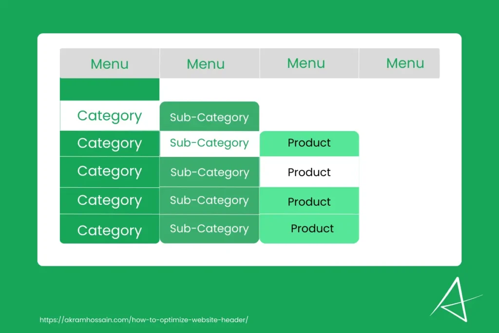
Try to set the category>subcategory>product; this type of sequence helps users get the right product by filtering the category.
Try to add some images of your category, that may helps users to identify the whole base of your product.
For example, If your products are Skin Care, Hair Care, Makeup, or similar, Write the Category name Health and Beauty. Here, you can add a “Lipstick” icon for user convenience.
Optimize For Mobile and Tablet Devices
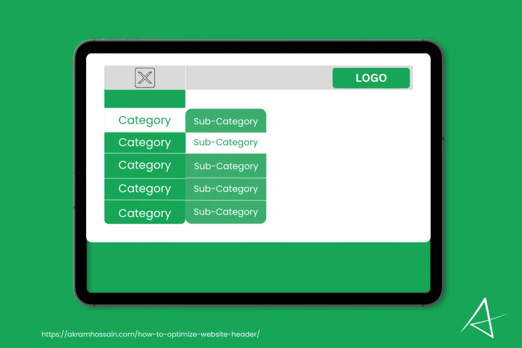
Based on different niche sites for eCommerce websites, almost 60-75% of traffic comes from mobile devices. A responsive mobile menu is the key to providing users with the highest value and the best user experience.
Mobile phones are very small devices, and you need to set the whole menu inside of them without cutting off anything from your header section.
You will add the clickable menu; it’s common for mobile devices, but you have to ensure the responsiveness for each item that should be visible.
First, you need to keep the menu loading faster and ensure the “Hamberger” menu is responsive while clicking on it.
It’s critical to optimize the menu for mobile, but you can use a right-side-slide or left-side-slide menu.
Create a panel where you can customize organized items in your header menu with Creativeway.
Add your menu items vertically so that it fits the mobile screen without losing the words. Also, vertical items are vertically scrollable so that users can navigate easily right from their end.
Example of an Ideal Header
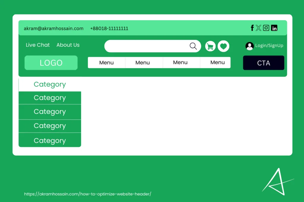
The header section of a website is a crucial element that serves as the primary navigational tool and sets the tone for the site’s overall user experience. An ideal header should include the following essential elements:
1. Logo:
The logo ensures brand recognition and is displayed prominently on the top left or middle. Depends on the header structure. Add the HOME page URL to the logo so that it’s clickable.
2. Navigation Menu:
I said the above navigation menu provides easy access to key site sections and items, which are common links, including Home, About, Services, Blog, Contact, and other pages.
The navigation menu design should be clear and intuitive.
3. Search Bar:
A search bar or box allows your users to quickly find specific products, categories, or content without going page after page.
It’s especially important for eCommerce and large content sites and reduces user brainstorming to find their desired content.
4. Call-to-Action (CTA) Button:
The CTA button always works to generate quick leads with a single click. It encourages user engagement by requiring them to click on it and interact with you. Depending on your site category, you can use the button text as ‘Sign Up,’ ‘Get Started,’ ‘Contact Us, ‘Get Free Demo,’ ‘Get Quote,’ and others.
The CTA button color should stand out with contrasting colors, and it should be visible to all device users.
5. Shopping Cart Icon:
The cart icon is a compulsory header item for eCommerce websites. It allows users to easily access their cart page and see their added items and prices.
So, in an eCommerce website, a cart icon is a must-have addition to the header.
6. Contact Information:
Need a quicker way to get user interaction via live chat, call, or email? You must add contact information in the website’s header area to make it visible right after the initial loading.
Add the Phone number, Email address, WhatsApp, or live chat URL so they can easily make contact flawlessly.
It’s really essential for a service or business website where customers need to talk to the service provider.
7. Social Media Icons:
Adding social media icons in the header is not compulsory, but it helps users connect with social handles. And they can get engaged with your social media page and easily get the latest updates from your pages.
Also, social media as a bit of a chance to convert your users into customers by engaging with your social media content.
By incorporating these elements, a website header can be both functional and aesthetically pleasing, contributing significantly to a positive user experience.
Conclusion
Whether you’re designing an eCommerce platform, a blog, a service-oriented site, or a business website, certain fundamental elements should be incorporated into the header section to make it effective and user-friendly.
These elements include a prominently displayed logo, a clear and intuitive navigation menu, a functional search bar, a compelling call-to-action button, a shopping cart icon for eCommerce sites, easily accessible contact information, and social media icons for enhanced connectivity.
By thoughtfully integrating these elements, you can create an aesthetically pleasing header that performs exceptionally well across different devices. This attention to detail will help ensure that your website visitors have a positive experience, leading to increased engagement, satisfaction, and, ultimately, the success of your website.
